
About the Project
Professional Tailwind CSS component and utility exploration platform with live previews and copy-paste code.
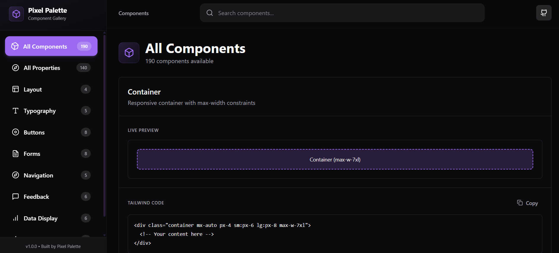
Project Overview
PixelPalette UI is a frontend-only project focused on clarity, interaction quality, and visual learning. Instead of acting purely as a component gallery, it combines:
- A curated UI component showcase
- A comprehensive Tailwind CSS properties reference
- Intentional design constraints to maintain consistency and polish
The result is a focused, professional interface that feels closer to a real internal design system tool than a demo project.
Key Features
UI Component Gallery
- Clean, production-style Tailwind components
- Consistent spacing, typography, and layout hierarchy
- Built for readability and reuse
Tailwind Properties Explorer
- 140+ Tailwind CSS utilities documented in one place
- Clear explanation of what each property does
- Syntax examples for quick reference
- Visual previews to reinforce understanding
- Designed to reduce constant context-switching to documentation
Single Dark Theme (Intentional)
- Custom dark purple theme across the entire app
- Theme toggles removed to maintain visual consistency
- Strong contrast and accessibility-aware color choices
Motion & UX Polish
- Smooth hover effects and transitions
- Subtle animations that enhance usability
- Custom loading screen featuring a 9-pixel boot animation before initial render
Minimal & Purposeful Navigation
- Simplified navigation for focus
- Direct GitHub repository access via navbar icon
- Removed unnecessary palette switching for a cleaner UX
Tech Stack
React · Vite · Tailwind CSS · JavaScript (ES6+)
No backend, no TypeScript — the project intentionally highlights strong frontend fundamentals and UI architecture using plain JavaScript.
Project Structure
src/
├── components/   # Reusable UI components
├── data/         # Component data & Tailwind property definitions
├── pages/        # Application views
├── hooks/        # Custom React hooks
└── lib/          # Shared utilities
Responsive Design
Mobile-first layout using Tailwind breakpoints: xs 475px · sm 640px · md 768px · lg 1024px · xl 1280px